Understanding Yarn Colors: Hue, Saturation, Value
- Blog Views : 1857
- Symfonie Yarns
- 13Jul, 2023
Color is part of the joy of life. It is a gift we all enjoy. Some of us delight in it so much that we study it, create with it and surround ourselves with it. Color results from light working in conjunction with our eyes and our surroundings. When light interacts with an object, some of it is absorbed while some is reflected. The light that is reflected in our eyes is what we see as color. This explains why descriptions of a specific color can vary from person to person. In a very real sense, color is subjective or, in other words, one person’s red may not be the same as yours.
When people discuss color, they may use a variety of terms. The word “Hue” is used interchangeably with the word “color”. Hue is the color that we see with our eyes.
The color wheel is a helpful tool for understanding hue. It arranges colors in a circle, with the primary colors of red, blue, and yellow at the center.
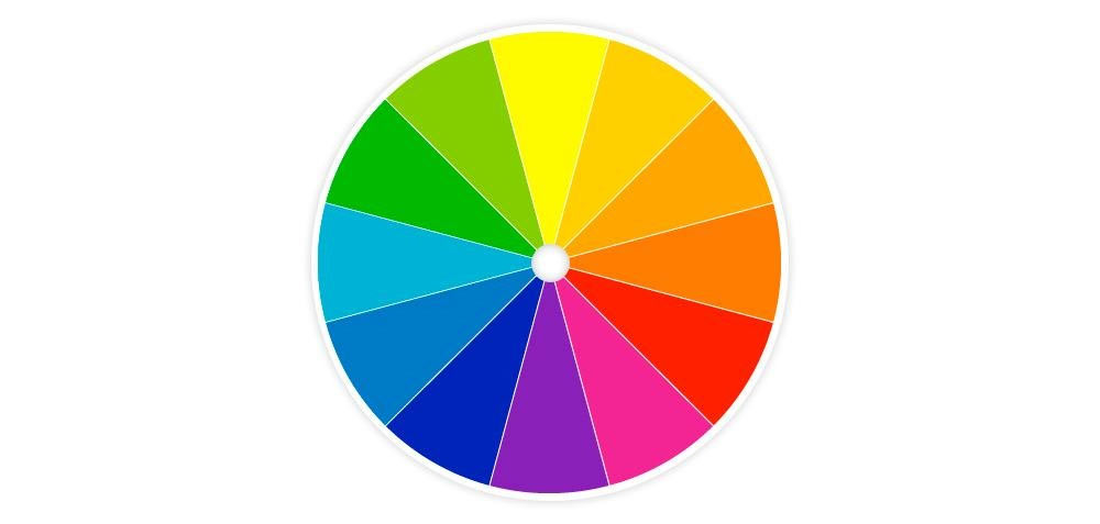
A color wheel can be an invaluable tool for anyone who wishes to understand or learn more about hues and/or colors. If, for instance, you wished to discover which colors are complimentary to one another – a good thing to know when combining colors in a knitting or sewing project or when decorating a room – you simply look at the top color on the wheel. The one opposite it is its complement.
Here’s a neat little online video on how to use a color wheel. This simple little wheel can unlock the secrets of tone and shades, as well.
Those who dye their yarns or cloth often use the word “Saturation” to describe the intensity of the color they are creating. Basically, saturation is a measure of the purity of a color. Another word used to describe this aspect of color is “chroma.” A color with high saturation is usually bright. While a color with low saturation appears more muted since it will have had white or black added to it to tone it down. If a color is 100% saturated, it means there isn’t any white or black in it.
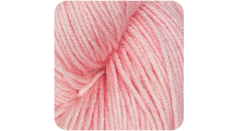
Conversely, if a color is desaturated with white, it will appear as a lighter version of itself. (Picture red with a lot of white in it and you will see pink, like this)
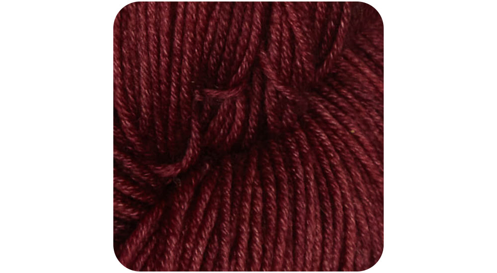
If it is desaturated with black, depending on how much, it will look more intense or dramatic, such as this:
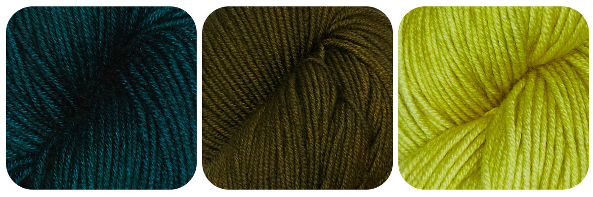
It is this constant adjustment of the chroma that creates many variations on one color. Here’s an example of exactly that type of adjustment to green. (This is from our new line of Symfonie yarns, Viva, a 100% superwash merino.) Far left is almost 100% saturated green, the center version has been desaturated with black creating a khaki variation, while far right has been lightened with white, creating a shade of citrus green.
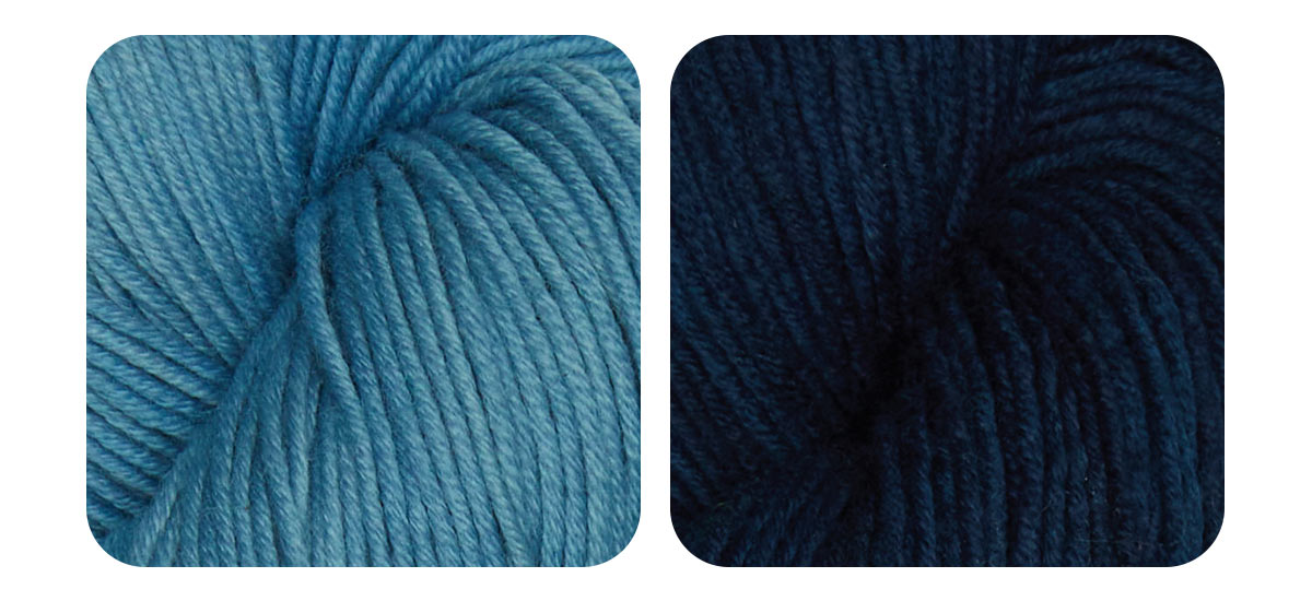
Value is a term used to describe light and dark within a color. White has the highest value and black has the lowest. A color with high value is light, while a color with a low value is dark. As an example, here is Flora, a naturally dyed yarn, derived from Indigo, in high and low value versions.
With many people experimenting with dyeing cloth and yarns there is an ongoing fascination with the subject of color and the many meanings ascribed to specific colors.
-
- 02 Dec,2025
-
- 27 Nov,2025
-
- 24 Nov,2025
-
- 19 Nov,2025
-
- 17 Nov,2025
-
- 10 Nov,2025
Copyright © Symfonie Yarns 2025 - all rights reserved | RSS Feed