The Power of Color: How to Select the Perfect Palette for Any Project
- Blog Views : 1152
- Symfonie Yarns
- 25Apr, 2024

Have you ever found yourself staring at a pile of yarn, wondering how to pick the perfect colors for your project? It's a dilemma we've all faced at some point- when we start feeling overwhelmed by the options we have. Whether you're into crochet, knitting, painting, or interior design, the power of color can make or break your creation. But don’t worry, because after reading this blog, things will be much easier for you while choosing the perfect palette for any project!
The Color Wheel

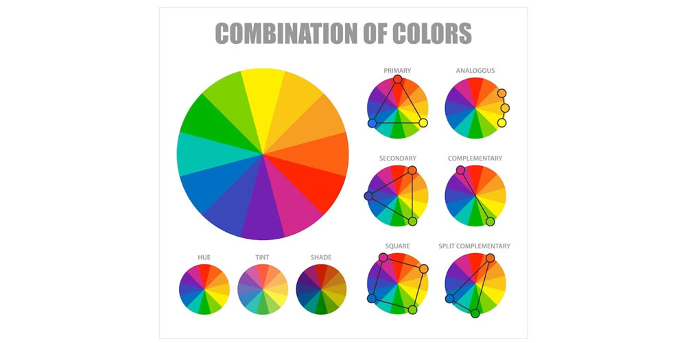
Let's start with the basics: the color wheel. Remember those lessons from school? Well, it's time for a quick refresher. At the heart of it, there are three primary colors: red, yellow, and blue. Mix them together, and you get secondary colors like green, orange, and purple. Keep mixing, and you'll uncover tertiary colors, such as sky blue or burgundy.
Now, let's talk about color schemes. These are the secret formulas for creating harmonious color combinations that please the eye. We have the monochromatic scheme, which involves using variations of a single color. Then there's the complementary scheme, where colors from opposite sides of the wheel are paired together for a vibrant contrast. Analogous schemes involve selecting colors that are adjacent to each other on the wheel, creating a soothing harmony. And finally, the triadic scheme takes three equidistant colors on the wheel to form a balanced trio.
But What About Balance?
Ah, yes, the age-old dance of black and white. Just like adding seasoning to a dish, these shades can enhance or tone down your colors. Mixing white with a hue lightens it, while adding black darkens it. So, if you want your project to exude softness and subtlety, reach for white. On the other hand, black injects drama and contrast, making your creation pop.
Imagine the depth and sophistication that Viva's Black Sand brings to your palette. It's not just any black; it's a statement, a bold stroke that commands attention and adds a touch of elegance to any project. When it comes to white, Viva's Jasmine stands out with its purity and brilliance. Like a blank canvas waiting to be painted, it serves as the perfect backdrop for your colorful creations, allowing them to shine with unmatched clarity and vibrancy.

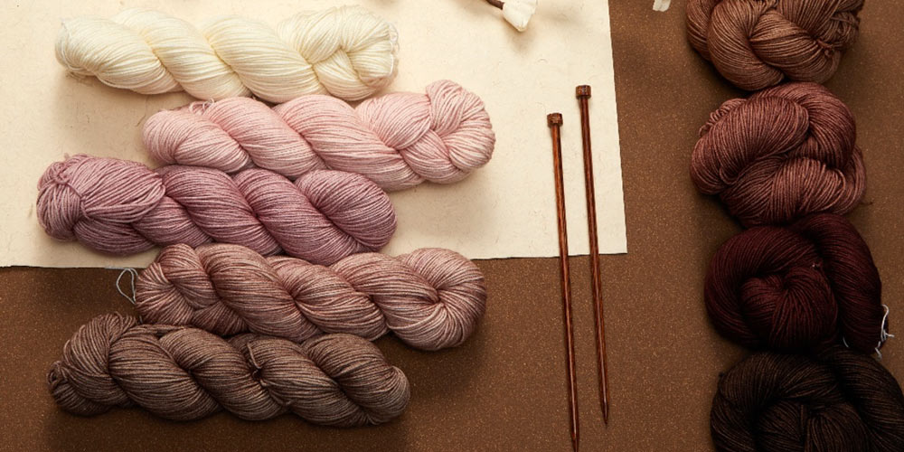
But wait, there's more to the balancing act. Enter grey and beige, the unsung heroes of color harmony. Beige is like a chameleon, effortlessly complementing any color it's paired with. And grey, with its myriad shades, can either soften or intensify your palette, depending on the hue.
Nature's subtle palette comes to life in Flora's beige and nude hues. Each shade tells a story of earthy elegance and timeless beauty, effortlessly blending with any color scheme to create a harmonious ensemble that speaks volumes.
And when it comes to the greys, we’ve got you covered there as well! Reflecting serenity and sophistication, Viva's Mirror in light grey adds a delicate touch to your palette. It softens bold hues and lends a sense of tranquility to your creations, like a gentle whisper amidst a bustling crowd. For those seeking depth and contrast, Viva's Plum Denim is the shade for you. This dark grey hue exudes mystery and allure, creating a captivating visual impact that draws the eye and adds a touch of drama to any project.
Color Inspo from Nature
Feeling unsure? Don't worry; nature has your back. Take a stroll outside and soak in the breathtaking hues of sunrise, plants, and flowers. Nature's color palette is a masterpiece in itself, offering endless inspiration for your projects. So, the next time you're at a loss for colors, just look to the world around you.
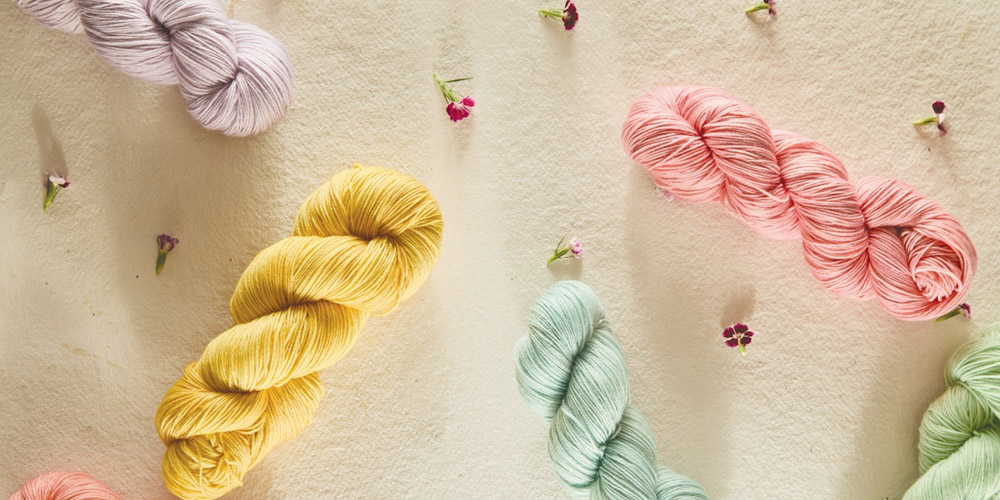
And with Symfonie Yarns’ hand-dyed yarn at your side, capturing nature's colors in your work is a seamless endeavor. Their diverse range of shades draws inspiration directly from the natural world, ensuring that your projects reflect the beauty of the outdoors. From the vibrant hues of Spinach Leaf to the zesty tones of Citrus, Symfonie Yarns offers an array of nature-inspired shades that will infuse your work with undeniable vibrancy.
Pinterest is Your Best Friend
Looking for an effortless way to discover the perfect color palette? Look no further than Pinterest. With a plethora of color palette boards available, simply type "color palettes" into the search bar and discover a world of options. From bold and vibrant combinations to soft and subtle hues, Pinterest offers thousands of inspiring color schemes at your fingertips.
Alternatively, draw inspiration from any captivating image you come across on Pinterest. Save those posts and use them as references when selecting a suitable color palette for your project.
Connect with fellow crafters or enthusiasts in your field; take inspiration from their finished projects. Observe how they expertly combined colors to achieve stunning results. Feel free to adopt their color combinations as they are or add your own unique twist to create something truly original.
In the end, selecting the perfect palette for your project is a journey of exploration and discovery. So, embrace the power of color, trust your instincts, and just follow your heart! After all, with the right colors by your side, Symfonie Yarns makes anything possible.
-
- 02 Dec,2025
-
- 27 Nov,2025
-
- 24 Nov,2025
-
- 19 Nov,2025
-
- 17 Nov,2025
-
- 10 Nov,2025
Copyright © Symfonie Yarns 2025 - all rights reserved | RSS Feed
