How to Select Color Combinations for Your Yarn Projects?
- Symfonie Yarns
- 22Mar, 2024
Imagine this: you've spent hours envisioning, planning, and carefully knitting a project that means the world to you. The design is flawless, the stitches are impeccable, but there's one thing that catches your eye – the colors. What if the hues you chose don't complement each other as you envisioned?
It's a heartbreaking scenario, and we all wish to never experience it. Colors play a pivotal role in evoking emotions, setting moods, and making a statement. When they don't work in harmony, even the most intricate patterns can lose their charm.
This is where yarn color theory steps in as your trusty guide. It's not just a set of rules; it's a tool that empowers you to make informed decisions about color combinations. Understanding the color wheel, primary, secondary, and tertiary colors, and how they interact can save you from the heartbreak of a mismatched palette.
The Color Wheel: Your Artistic Compass
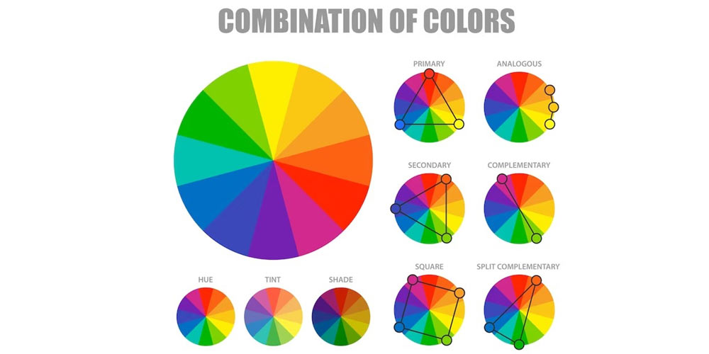
The color wheel is like the ultimate palette for your knitting adventures. It consists of twelve pure colors, minus the tones, saturation, or brightness. Primary colors—red, blue, and yellow, are the foundational colors that give birth to secondary colors like purple, green, and orange. Tertiary colors, all the other fabulous shades, emerge from a blend of primaries and secondaries. Splitting the wheel in half reveals warm and cold colors, with yellow as the friendly neighbor on the warm side, although it is generally classified as a neutral color. Understanding this wheel is your key to understanding different color combinations.
Creating a Symphony of Colors with Symfonie Yarns
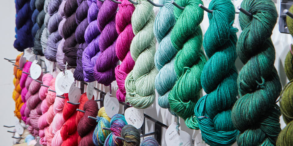
Now, let's talk about translating this color theory into your yarn projects, and what better companion for this act of love than Symfonie Yarns? Their premium semisolid and variegated hues are like a painter's dream, offering a palette that sparks a visual delight you’ll find nowhere else.
Analogous Colors: Imagine colors sitting next to each other on the wheel – like friends who just click. Analogous colors are a breeze to mix and create stunning combinations. Now, if you're aiming for an analogous combination that not only clicks but sparks joy and admiration, let us introduce you to a duo that's nothing short of spectacular – Viva’s Pink Mauve and Purple Fuchsia. Pink Mauve, being a shade that dances on the delicate line between pink and mauve, blended with Purple Fuchsia – a deep, rich purple that's like a bold stroke on a canvas, will exude confidence and a touch of drama, making them both the perfect pairing partners for your next project.
Complementary Colors: For those who crave boldness and contrast, look no further than complementary colors. Complementary colors are pairs of colors that, when combined, create a high contrast and vibrant effect. These colors are located opposite to each other on the color wheel. This dynamic relationship is a fundamental principle in color theory and is widely used in various forms of art and design. For this one, we recommend the dynamic duo of Mango and Amethyst from Viva’s premium merino blend.
Mango, a warm and lively shade reminiscent of the tropical fruit brings a burst of warmth to the overall color palette. On the other side of the wheel, we have Amethyst, a regal and deep purple with a touch of red undertones. Amethyst serves as the perfect complement to the warmth of Mango, adding a cool and contrasting element.
Triadic Combination: A triadic combination in color theory involves selecting three colors that are evenly spaced around the color wheel. This method creates a balanced and harmonious palette by incorporating a range of hues. The selected colors in a triadic combination form an equilateral triangle on the color wheel, ensuring that each color is visually equidistant from the others. For a brilliant tradic combination, we recommend Sunset, a rusty orange hue that exudes warmth and coziness; paired up with Palace Lawn, a vibrant green that embodies the freshness of lush lawns and the vitality of nature. To complete the triad, add Aubergine, a muted purple that brings a sense of elegance and tranquility to your overall piece.
Double-Complementary Combination: A double-complementary combination, also known as a tetrad, involves selecting four colors on the color wheel that form two sets of complementary pairs. The pairs of complementary colors, when combined, create a balanced and dynamic palette for various artistic projects. Symfonie Yarns wide range of marvelous hues allow for magical pairings in this combination. Imagine the richness of Delhi Blue, a deep and sophisticated shade that echoes the depth of the night sky over a bustling city, paired with Peacock Green a stunning cool shade to balance it all out. Together, they form one half of the tetrad, laying the foundation for a captivating color symphony.
On the other half of the color wheel, we recommend the warm and spicy duo of Dried Chiles and Turmeric. Dried Chiles, with its earthy red tones, pairs beautifully with the golden warmth of Turmeric. This combination brings a sense of warmth, energy, and a touch of exotic flair to your projects.
Let's not forget about neutrals! Adding a neutral color to the mix can be a game-changer. With shades like Brown Eggshell and Mirror, your projects will capture the essence of the main shades without looking too overwhelming. Most importantly, let your feelings guide the way. After all, knitting is an art, and your instincts are your best tools!
-
- 18 May,2024
-
- 16 May,2024
-
- 10 May,2024
-
- 06 May,2024
-
- 30 Apr,2024
-
- 25 Apr,2024
Copyright © Symfonie Yarns 2024 - all rights reserved